Structure of Advertisements
Today we talked about the general aspects of ads; ads in newspapers vs ads in magazines. Namely, the text and picture part. Alongside, I have added more to the presentation today in regards to formal description. Take notice again to the 3 levels of meaning.
Picture and Text
Three different forms of text-picture-relations
1. equal relation between text and picture
a) Text-centred ads
• Text is in the foreground because of its information content
• Picture is the redundant element and visualise or concretise the content of the text
b) Picture-centred ads
• Picture is in the foreground
• Text is the redundant element, that specify and illustrate the picture
c) Text and picture-centred ads
• Text and picture depend on each other
2. Text-dominated ads
• Text is in the foreground
• Picture is not directly an explanation or illustration of the text
3. Picture-dominated ads
• Picture tells us the massage of the ad
• Language is used for slogan or brand’s name
Here is the following text to the non-verbal means:
Form and Content of Pictures
1) Visual perception
- people explore, select and organise objects in the visual field
- different cultures different interpretations
- understanding of a picture consists of previous knowledge
2) Non verbal means
Appearance
a) Age
b) Gender
c) National and racial
d) Hair
e) Body
f) Size
g) Looks
Manner
a) Expression
b) Eye contact
c) Pose
d) Clothes
Activity
a) Touch
b) Body movement
c) Positional Communication
three levels of meaning in an image
a) primary or natural subject matter
b) secondary or conventional subject matter
c) intrinsic meaning or content
----------------------------------------------------------
3) Formal description of pictures
a) Is a picture dynamic or static?
b) Is a picture coloured or black-white?
• different meanings of colours
• e.g. red → energy, power, passion; white → light, innocence, purity, cleanliness
c) Is a picture real or abstract?
d) Are the contents of pictures real or fictional?
--------------------------------------------------------
Question to discuss,
Did you ever think that there is so much (theory) that is put into creating an advertisements? Do you utilize these real/ideal, given/new concepts when you see an ad?
What is the purpose behind using only text-centered ads; picture-centred ads; text and picture-centered ads; text-dominated ads, and picture-dominated ads?
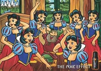
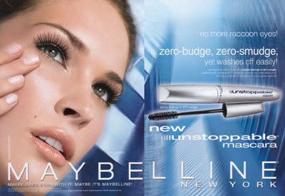
What are the differences between such ads? Take a look at these ads.
Again go back to Lea and Christin's points in analysing a photograph:
Focus and depth of vision, Close-ups, Lighting and colour, Cropping, and Camera angle.
How do these ads add up?




0 Comments:
Post a Comment
<< Home